Why Certain Booths Become the Booth Everyone Mentions
A true showstopper trade show booth is not simply larger, louder, or more expensive than the booths around it. It becomes memorable because every visible choice helps an attendee understand what is worth noticing, where to enter, and why the experience deserves a pause. For exhibitors, brand teams, and booth designers, the useful lesson is not to copy a dramatic shape or a trendy finish. The lesson is to study how strong exhibits turn lighting, scale, product placement, hospitality, and movement into one clear visitor moment.
The Spotlight Starts Before the Visitor Stops
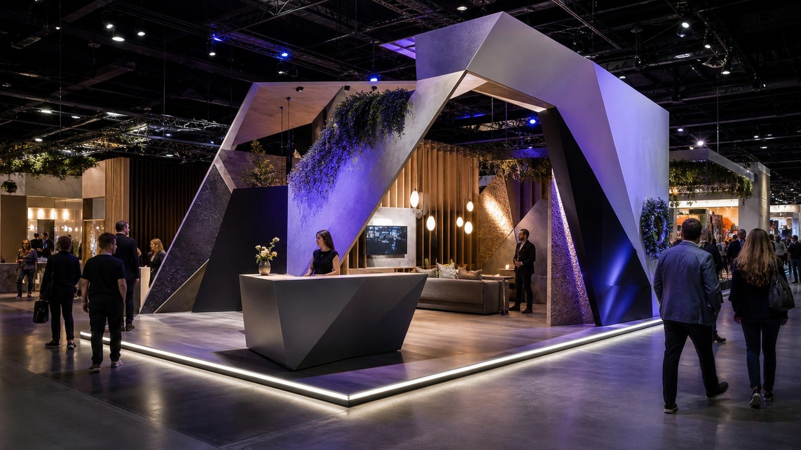
The first job of a showstopper booth is orientation. A person walking an aisle is already filtering noise, badges, booth staff, floor graphics, hanging signs, and competing demonstrations, so the best exhibits give that person one confident read from a distance. That read might be a sculptural canopy, a glowing product wall, a staged demo counter, or a hospitality zone that looks calm in a busy hall. What matters is that the first impression has a center of gravity instead of a pile of disconnected features.
Many booths try to earn attention by adding more surfaces, more screens, and more messaging. Showstopper booths usually do the opposite: they choose a hierarchy and protect it. A visitor can tell what the booth is about before stepping inside, then discover richer details after crossing the aisle line. That progression keeps the design from exhausting the audience before a conversation begins.
This is why the most photographed booths often feel almost simple in memory. They may contain complex fabrication, lighting control, storage, meeting space, and product support, but the visitor remembers a single invitation. The booth said, in effect, look here first, then come closer if this is relevant to you.
For planning teams, this means the first creative review should include a visitor-path conversation rather than only a visual critique. Ask what the attendee notices at sixty feet, what becomes clear at twenty feet, and what feels inviting at the aisle edge. That sequence exposes weak spots early. A booth can have a spectacular rendering and still fail if the approach feels blocked, the offer is vague, or the most interesting detail is visible only from a camera angle that attendees will never occupy.
A useful test is to describe the booth without naming colors, materials, or dimensions. If the description still sounds compelling, the concept probably has a strong behavioral core. If the booth can only be described as big, bright, modern, or dramatic, the team may need to sharpen the visitor promise before committing to fabrication. The spotlight should illuminate a reason to engage, not merely the fact that money was spent.
Use Scale Without Letting Scale Do All the Work
Large exhibits have an obvious advantage, but size alone rarely makes a booth worth remembering. A tall structure can disappear if it does not frame a clear offer, while a compact island can dominate an aisle when it uses height, contrast, and open sightlines intelligently. Scale works best when it gives the visitor confidence, not when it simply announces budget.
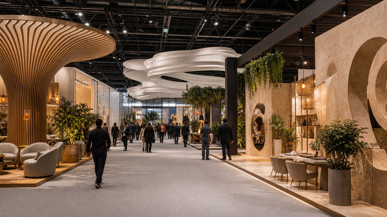
The strongest large booths often divide attention into layers. Overhead elements help people locate the brand from far away, mid-level displays explain the experience, and lower-level counters or demo stations invite the next step. When those layers agree, the booth feels intentional from every distance. When they compete, the exhibit may photograph well from one angle but feel confusing on the floor.
Exhibitors should also think about emotional scale. A booth can feel grand because it gives people room to move, space to watch a demo, or a quieter place to talk after the first attraction. That kind of scale is measured by comfort and confidence as much as square footage.
Another practical issue is pacing. A showstopper booth does not need to reveal everything instantly. It can use the first view to create recognition, the entry to create comfort, and the interior to create proof. This layered approach gives different attendees different ways to engage. Casual browsers can understand the story quickly, while serious buyers can find enough substance to justify a longer conversation.
Design the Moment People Want to Share
A showstopper gallery is useful only if it teaches why people pull out a phone, point something out to a colleague, or mention a booth later in the day. Shareable moments usually have a visible payoff: a product revealed in a surprising way, a material contrast that feels tactile, a lighting transition that changes mood, or a demonstration that makes the value obvious without a long pitch. The moment should belong to the brand rather than feeling like an unrelated attraction.
This does not mean every booth needs a spectacle. In B2B environments, a polished working demonstration can be more powerful than a theatrical stunt because it helps buyers picture a real use case. The shareable quality comes from clarity. People pass along what they can explain quickly.
The best booths make sharing easy for staff too. When the visual center of the exhibit matches the sales story, staff can invite visitors toward the most persuasive part of the space instead of improvising around whatever happens to catch attention.
Scale also affects staff confidence. When the design gives people a clear greeting point and an obvious next destination, staff can focus on qualifying and listening instead of rescuing the layout. That confidence changes the energy of the booth. Visitors sense when a team is working with the space rather than fighting it, and the exhibit feels more generous as a result.
The same thinking applies to smaller activations inside a large exhibit. A dramatic tower may attract attention, but a well-placed product vignette can carry the emotional weight once people arrive. The booth should have moments that work at several levels of commitment. Someone who only glances should get the point, while someone who stays should discover more specific evidence.
Let Materials Carry Some of the Message
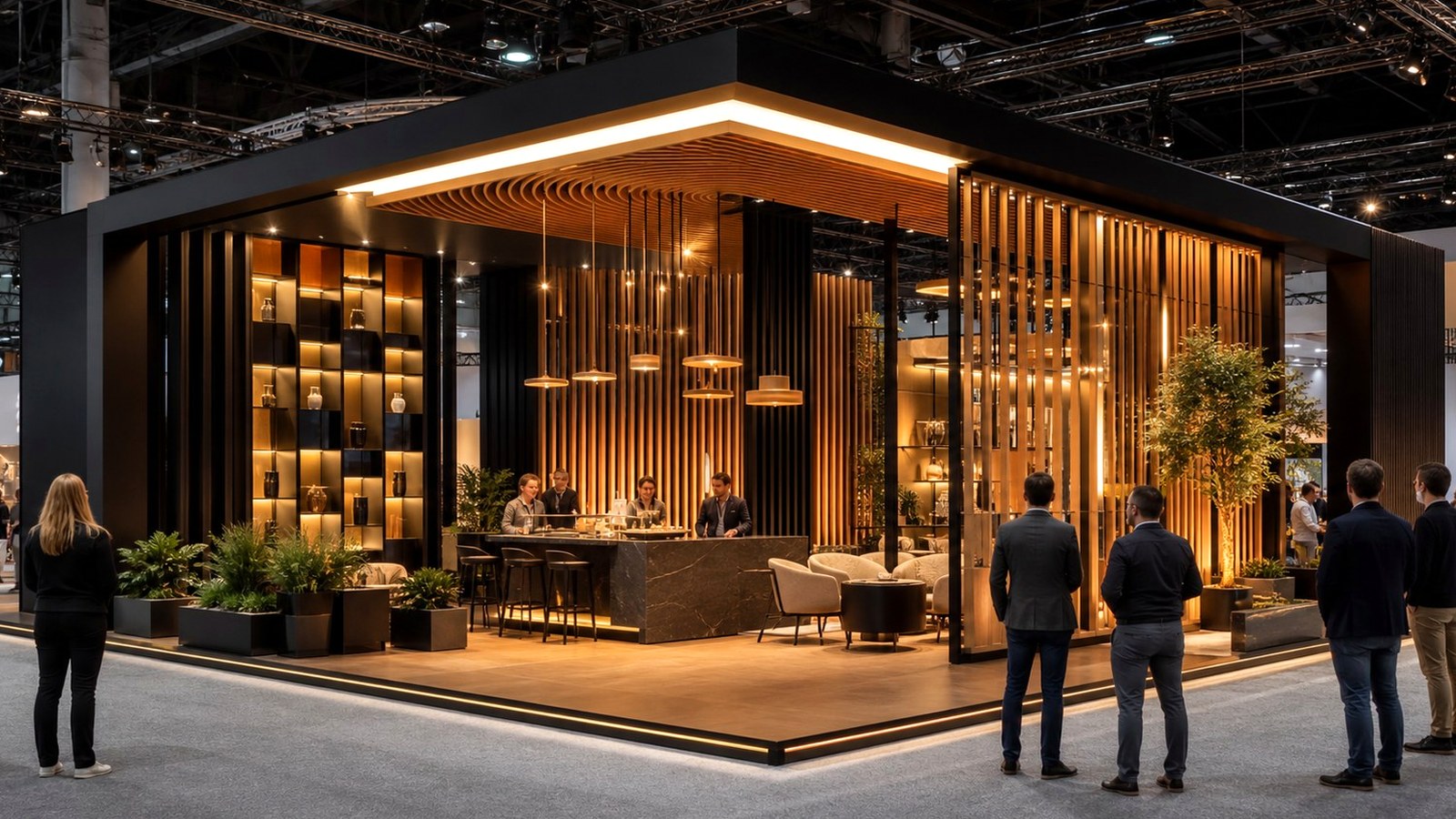
Materials matter because they tell visitors how the brand thinks before anyone says a word. Warm wood can make a technical product feel approachable. Brushed metal can signal precision. Fabric, acoustic panels, and softer seating can make a consultation area feel less like a sales trap. The right material choices reduce the amount of copy the booth needs to explain its personality.
Showstopper booths often pair familiar trade show components with one or two unusually well-executed details. A curved wall, recessed light channel, dimensional product shelf, or seamless reception counter can make the entire booth feel elevated. The detail does not need to be extravagant; it needs to be consistent with the story the exhibitor wants attendees to believe.
The risk is using premium finishes as decoration instead of communication. If a surface looks expensive but does not help with wayfinding, product understanding, hospitality, or brand trust, it may impress designers while doing little for the visitor. Strong exhibits make materials work.
Shareability should be planned with restraint. If the booth includes a photo-worthy element, it should not become a bottleneck or a gimmick detached from the brand. The best shared moments help the attendee remember the exhibitor's expertise. They also give sales teams a natural opening: people can talk about what they just saw, touched, compared, or experienced instead of beginning with a cold pitch.
Build for Staff Behavior, Not Just Photography
A booth can steal the spotlight in photos and still underperform if staff have nowhere natural to stand, greet, demonstrate, or qualify visitors. The best designs anticipate human behavior. They create an obvious welcome point, leave room for small groups to gather, and give staff a way to move from casual greeting to deeper conversation without blocking the aisle.
This operational layer is often what separates a beautiful booth from a useful one. If a dramatic entry feature causes congestion, visitors may admire it while walking past. If a demo counter faces the wrong direction, the energy of the booth leaks into dead space. If meeting rooms are too hidden, qualified attendees may never understand that a private conversation is available.
A memorable booth should therefore be judged twice: once as an image and once as a working environment. The real showstopper is the exhibit that looks magnetic from the aisle and still functions after the first wave of attention arrives.
Material choices can support this kind of memory by giving the booth a physical vocabulary. A booth for a precision manufacturer may rely on crisp edges and controlled reflections. A booth for a hospitality or wellness brand may need warmth, texture, and acoustic softness. When materials match the business promise, the design feels less like scenery and more like evidence.
Operational planning belongs in the same conversation. The booth needs places for bags, literature, tools, staff belongings, samples, and technology, but those needs should never leak into the visitor story. Clean operation is part of the showstopper effect because it lets attention stay on the intended experience. Many booths lose impact not through weak design, but through visible improvisation after the doors open.
Turn Inspiration Into a Practical Design Brief
When reviewing standout booth examples, teams should resist the urge to collect only visual references. A stronger gallery review asks what each booth is solving. Is it making a complex product easier to understand? Is it creating hospitality in a crowded hall? Is it proving category leadership? Is it giving a sales team a better way to start conversations?
Those questions turn inspiration into a brief that a designer, fabricator, marketer, and sales leader can all use. The output might be a need for a taller beacon, a more open demo zone, stronger lighting contrast, a calmer meeting area, or a tighter product story. The booth becomes more original when the team translates the underlying tactic instead of copying the visible finish.
Showstopper booths steal the spotlight because they make choice feel easy. They help the right visitor notice, approach, understand, and remember. That is the standard worth carrying into the next exhibit plan.
The final brief should name the feeling and the function together. For example, the booth may need to feel like a confident category leader while moving visitors from a public demo into scheduled consultations. That kind of sentence gives creative teams room to design and gives business teams a way to judge the result. It also keeps the spotlight tied to outcomes.
A final way to judge a spotlight booth is to ask what the visitor would tell a colleague who missed the show. If the answer is only that the booth was huge, the design may not have created a durable business memory. If the answer includes what the company demonstrated, how the space felt, and why the encounter seemed worth repeating, the booth has done more than attract attention. It has turned visual presence into brand meaning.
That is the practical value of studying showstopper galleries. The goal is not to build the loudest exhibit in the hall. The goal is to design a booth that earns attention honestly, uses that attention generously, and gives the right attendee a reason to continue the conversation after the aisle has moved on.