A Visual Pattern Library for Better Exhibit Decisions
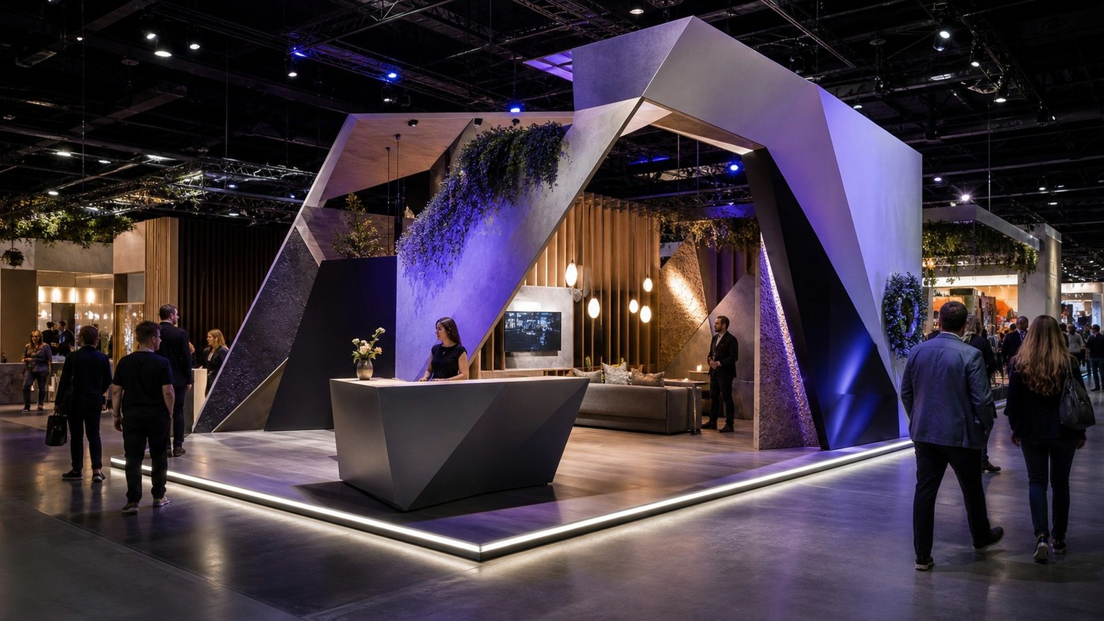
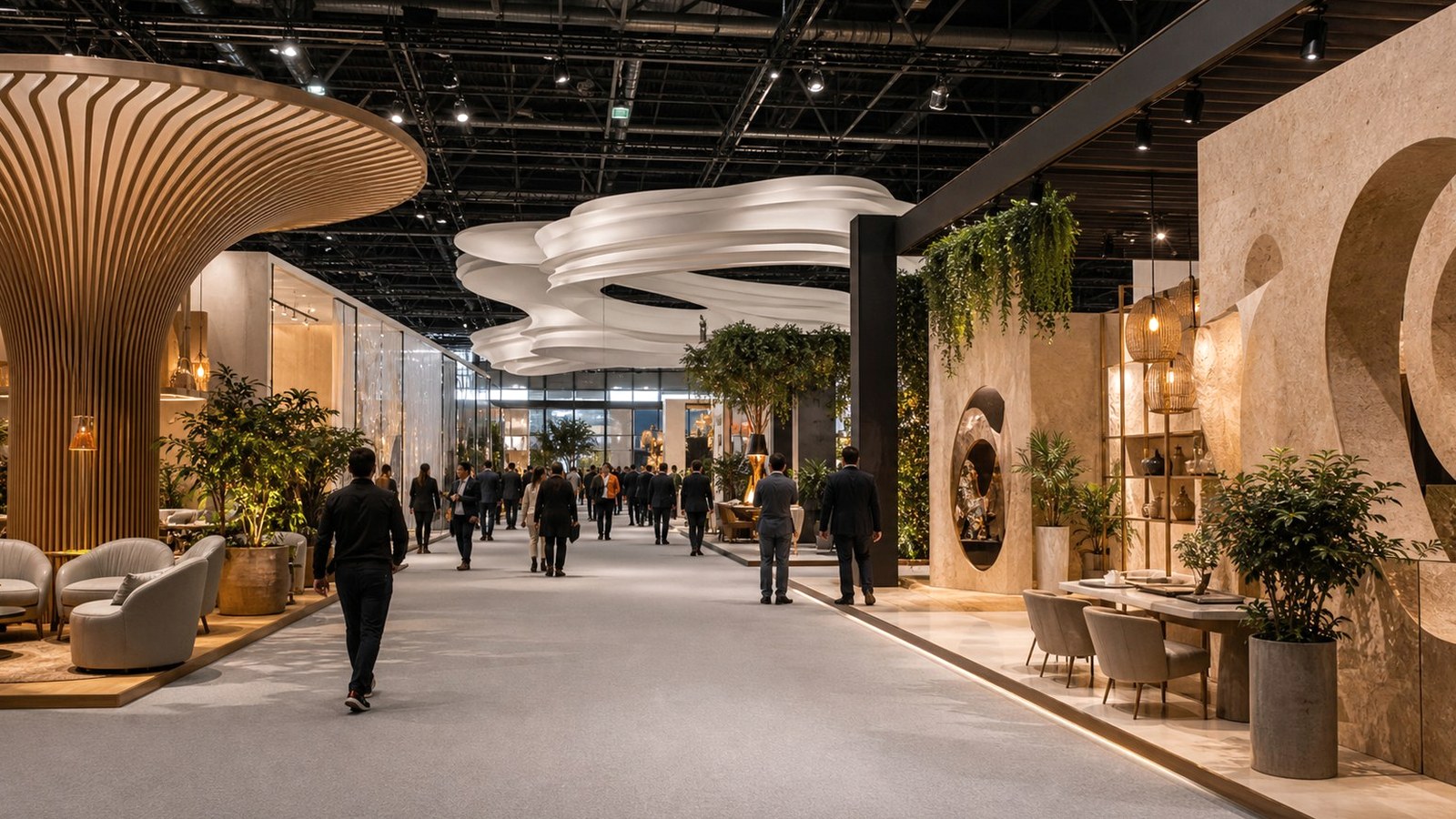
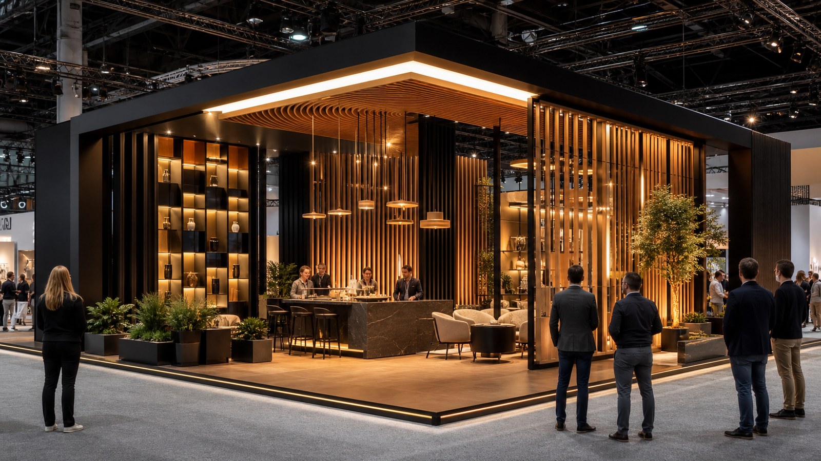
Jaw-dropping trade show booth design is most useful when it becomes a pattern library rather than a mood board. Exhibitors can learn from bold exhibits by looking past the immediate wow factor and asking how each booth earns attention, controls movement, explains value, and supports a real conversation. The strongest examples are not random acts of imagination. They are designed systems that turn curiosity into a useful next step.
Look for Patterns, Not Just Pretty Pictures
A gallery of jaw-dropping booths can become overwhelming if every image is judged only by taste. The better approach is to sort examples by the problem they solve: long-range visibility, product explanation, meeting comfort, hospitality, brand authority, or traffic control. Once the booth is evaluated as a solution, the design lesson becomes easier to adapt.
Some exhibits earn attention with overhead architecture. Others do it with glowing product walls, live demonstrations, unexpected materials, or open hospitality. These choices should not be copied blindly because the same feature can help one brand and confuse another. The useful question is what kind of visitor behavior the feature creates.
A strong design review therefore pairs inspiration with function. If an idea looks impressive but does not help people enter, understand, compare, ask, or remember, it belongs in the mood board rather than the brief.
A pattern library also helps teams avoid the trap of chasing novelty at every show. If the same company attends several events in a year, the booth system needs enough consistency to build recognition and enough flexibility to fit different halls, footprints, and audiences. Studying many examples makes that balance easier to see. The team can identify which ideas are permanent brand assets and which are campaign-specific expressions.
The strongest gallery review sessions include sales, marketing, operations, and fabrication voices. Sales can explain which features would support real conversations. Marketing can protect the brand story. Operations can flag setup, storage, and staffing concerns. Fabrication partners can translate inspiration into practical choices. When those perspectives meet early, the final design is less likely to become a beautiful idea that collapses under show conditions.
Separate the Long View From the Close View
The long view is what attendees understand while moving. It needs a clean silhouette, a visible category cue, and enough contrast to separate the booth from neighboring exhibits. The close view is where trust develops through materials, product proof, staff posture, seating, lighting quality, and the absence of clutter.
Jaw-dropping designs usually succeed at both distances. From far away, they provide a reason to approach. Up close, they reward the approach with detail. A booth that looks impressive only in a rendering may lose power when visitors discover that the entry is cramped or the product story is hidden.
Exhibitors should review designs from the aisle first, then from inside the booth. That sequence mirrors the actual visitor experience and keeps the team honest about what the design is asking people to do.
Teams should also separate booth ideas by buying stage. Some designs are excellent for awareness because they create a quick visual hook. Others support comparison because they organize product information clearly. Others are best for late-stage conversations because they offer privacy and comfort. A jaw-dropping example is more useful when the team knows which stage it serves.
Use Variety to Clarify the Brand
A gallery title promises variety, but the booth itself should not feel like a sample tray of unrelated ideas. The best exhibits use variety to support a brand point. A technology company may combine clean architecture with precise lighting. A wellness brand may use softer edges and warmer hospitality. An industrial supplier may show strength through durable surfaces and clear demonstrations.
The design becomes jaw-dropping when those choices feel inevitable. Visitors may not analyze the reasons in detail, but they sense when the space has a coherent personality. That coherence gives staff a stronger platform because the booth has already begun the explanation.
Variety is most effective when it creates zones with purpose. A display wall, demo area, meeting table, and reception point can each feel different while still belonging to the same story.
The long-view and close-view distinction becomes especially important in crowded categories. From far away, the booth may need a silhouette or lighting strategy that separates it from competitors. Up close, the details need to prove credibility. If those two levels tell different stories, visitors may approach with interest and leave with uncertainty.
Gallery examples can also reveal how much copy a booth really needs. Many strong exhibits use fewer words because the spatial story is doing more work. This does not mean eliminating messaging. It means placing the right message where it answers the visitor's next question. A headline, product label, or proof point is more powerful when it appears at the moment of need.
Make the Demo Worth Watching
Many memorable booth designs include a demonstration area because motion attracts attention and proof reduces hesitation. The demo does not need to be loud. It needs to be visible, timed well, and easy to understand in a few seconds. A visitor should be able to watch from the aisle without feeling trapped.
The best demo zones also protect staff from awkward traffic patterns. They leave room for observers, create a natural handoff to a specialist, and avoid blocking the entry. When the demo is designed as part of the architecture, it feels like the reason the booth exists rather than an activity squeezed into the corner.
A jaw-dropping booth should therefore be judged by what happens after curiosity begins. If the visitor has no clear next step, the design has spent attention without converting it into value.
Demonstrations deserve special attention because they often determine whether a design becomes a working booth or a static display. A beautiful demo counter that faces the wrong direction will underperform. A simple demo station with excellent visibility and staff flow can outperform a more elaborate feature. The gallery should therefore be reviewed for human movement, not just visual drama.
Translate the Gallery Into Decisions
Teams can turn a booth gallery into a working plan by choosing three lessons at most. One lesson might address visibility, another might improve visitor comfort, and another might sharpen product explanation. Limiting the list keeps the next booth from becoming a collage of admired references.
The final design brief should describe desired behavior instead of only desired appearance. For example, the team may want attendees to see the booth from two aisles away, understand the category in five seconds, watch a demo without entering, and step into a quieter space for a qualified discussion. Those behaviors give designers a clearer target.
Jaw-dropping booths are valuable because they expand what a team believes is possible. They become profitable when that inspiration is translated into a booth that fits the audience, the sales motion, and the reality of the show floor.
When teams narrow their references, they should choose examples that fit budget reality without shrinking ambition. A booth may not be able to reproduce a custom overhead sculpture, but it may borrow the underlying idea of a clear landmark. It may not use the same materials, but it can still create a tactile moment that makes the brand feel more credible.
The last step is to turn each selected reference into a decision. Instead of saving an image called cool booth, rename the lesson: long-range beacon, open demo theater, quiet buyer lounge, modular product wall, hospitality threshold, or premium material proof. This small discipline makes the design process more strategic and less dependent on taste.
A list of fifty impressive booths can be energizing, but the number itself is not the point. The point is exposure to enough variety that a team stops assuming there is only one way to look credible on a trade show floor. Some booths win through architecture, some through hospitality, some through demonstration, some through beautifully edited product storytelling, and some through a surprisingly quiet confidence. Seeing those differences expands the design vocabulary available for the next brief.
That broader vocabulary is especially useful when internal stakeholders have different instincts. A sales leader may want more meeting space. A brand leader may want stronger visual recognition. A product leader may want deeper proof. A gallery of strong examples gives the team a neutral way to discuss tradeoffs. Instead of arguing from preference, everyone can point to how a specific booth solved a specific problem and whether that problem resembles the one at hand.
The best use of the gallery is to create categories before choosing favorites. Sort examples into visibility, education, hospitality, interaction, premium craft, compact impact, and operational efficiency. A booth that looks less dramatic at first glance may become more valuable when it solves a category the team actually struggles with. This prevents the loudest image from winning the planning process simply because it creates the strongest immediate reaction.
Design teams should also examine what each booth leaves out. Jaw-dropping exhibits often feel powerful because they resist the urge to show every product, claim every benefit, and fill every blank surface. The omissions are part of the design. They guide the visitor toward the intended message and give staff room to expand the conversation. A booth that says less at first can sometimes create more meaningful engagement.
Finally, remember that a gallery is a translation exercise. The next booth may use a different footprint, budget, audience, and show objective, so the reference should be adapted rather than copied. Borrow the principle: a clearer beacon, a warmer threshold, a better demo view, a calmer meeting zone, or a more tactile product story. When those principles are applied with discipline, the booth can feel fresh without becoming a replica of someone else's success.
It also helps to review references against the show calendar. A booth built for a major industry launch may need more drama than a regional event focused on existing customer meetings. A design that is perfect for one environment can be excessive or underpowered in another. Matching inspiration to show purpose keeps the team from overspending on the wrong kind of impact.
Budget conversations become more productive when each admired feature has a job. Instead of debating whether a curved wall or overhead element is worth the cost, the team can ask whether it improves recognition, dwell time, product comprehension, or meeting quality. Features that cannot answer those questions should be simplified first.
The final gallery shortlist should feel balanced. Include at least one example for attraction, one for education, one for hospitality, one for compact efficiency, and one for premium craft. That mix keeps the team from mistaking a single aesthetic preference for a complete exhibit strategy.
A practical next step is to assign each shortlisted idea to an owner. Marketing can own the visibility lesson, sales can own the conversation path, operations can own setup and storage implications, and design can own visual translation. This turns inspiration into accountable planning. The booth improves because admired examples become decisions rather than forgotten screenshots.
Use that ownership to create the next revision brief.